24 May 2013
Public lettering walk with Phil Baines and Catherine Dixon
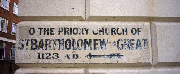
Yesterday I had the pleasure of joining Phil Baines and Catherine Dixon on their latest Public Lettering walk, organised through the excellent St Bride Library events programme. As with my earlier walking tour in this part of London (Type Tour West) it started at the library but then took a different route to weave through Smithfield before ending up at the lettering- and tankard-fest that is the Fox & Anchor pub in Farringdon.
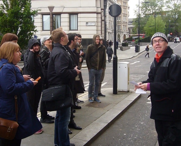
Phil Baines and Catherine Dixon are extremely passionate about lettering on the streets, and jointly authored the excellent ‘Signs: lettering in the environment‘. This, and Phil’s previous public lettering walks, made them knowledgeable guides for the evening.
At the outset there was a clear distinction made between type and lettering, the former referring to mechanically reproducible letter forms as opposed to those created just once for a specific context. This was followed by some brief discussion about the grey area of hand-painted brand campaigns, such as those for Hovis, Gillette and Bovril, where the reproduction isn’t mechanical but strives towards this end. Perhaps there are mutual influences between lettering and type, with each able to borrow from the other. This would certainly make an interesting line of further investigation.
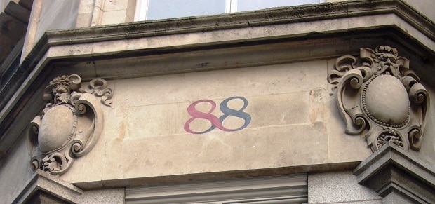
These tours should probably come with a health warning, namely that after going on them you won’t ever be able to get anywhere for stopping every two feet to admire or critique some form of public lettering. Even as we walked, Phil and Catherine were both spotting things they’d never noticed before such as this lovely roulette-esque 88 on Fleet Street (above). As with ghostsigns, it is these little details that all too often escape us until we take the time to walk slowly and appreciate the beauty, or otherwise, that exists around us. I won’t name names but Phil in particular had a few gripes with some of the more prominent groups of lettering that we found on the walk. Passion cuts both ways and it was great to see someone get fired up about some of the stuff that gets approved for public display.
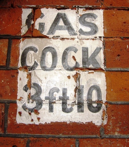
Just like the Black Cat Cigarettes ghostsign, this Gas Cock palimpsest is one that I’ve cycled past many times without noticing. The area around Smithfields that the tour covered is extremely rich with a diverse and historically noteworthy set of public lettering. Phil and Catherine used this to tell a story of how the area developed both commercially and architecturally, with reference to the evolution of the lettering forms that accompanied this. I learned new terms such as the oxymoronic-sounding ‘curvilinear’, alongside other obscure facts such as there being no roads in the City of London (but lots of streets, walks, and squares).
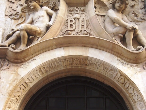
[NB. The architect and sculptor recognised with these markings above the entrance to this building on Fleet Street, something you don’t often see in stone work such as this.]
In spite of the almost Arctic weather conditions (take me back to Cambodia!) a great time was had by all and the pub finish was an opportunity to chat with other enthusiasts about all sorts of lettering, type and design topics. I hope that another tour is developed/runs soon, and one day I must get round to adding my own to the growing list of ghostsigns and lettering tours.


