23 Jul 2014
Ghostsigns Restorations in Cambridge
This is the third and final post in a series documenting recent ghostsign restorations across the UK. It follows coverage of the Palladium Cinema restoration in Morecambe, and the repainting of the Larkspur Soft Drinks sign in Bradford. The focus this time is Cambridge and a slightly different approach to those previously covered.
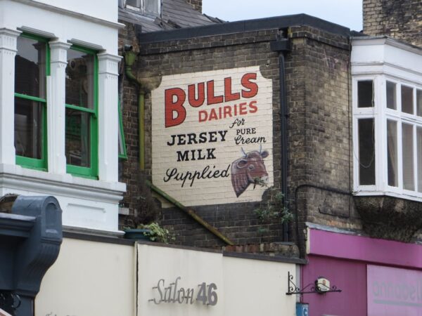
The Bulls Dairies sign pictured above was the main photo on my extended post about repainting ghostsigns, ‘A Fresh Lick of Paint‘. It is a well-known example of the restoration trend. However, its Cambridge home is now, to my knowledge, unique in the UK for taking a city-wide approach to appraising and restoring ghostsigns. The Morecambe and Bradford examples were conceived and funded locally with the focus on a single sign. In the case of Cambridge, the city council has commissioned a survey of ghostsigns and is now embarking on repainting these en masse.
In the November 2012 briefing note and appraisal, ‘Restoration of Cambridge’s Historic Advertising Signs‘, the stated objective of the project is:
To re-instate as many of the existing historic signage to their original condition around the city as possible using available Council Funding
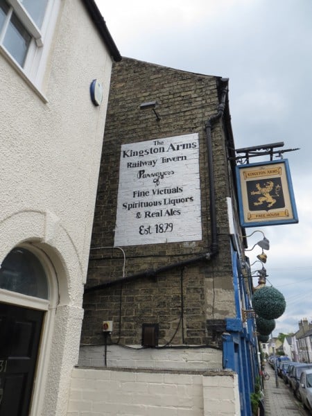
The Bulls Dairies sign was a precursor to these efforts, and possibly an inspiration for them. Likewise the repainting of the Kingston Arms pub sign below. In this second example the business is still trading and so the sign is serving a genuine commercial purpose, as opposed to the defunct dairy.
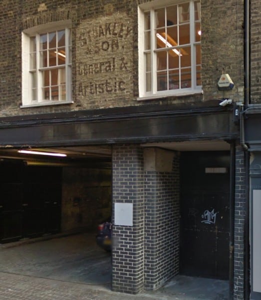
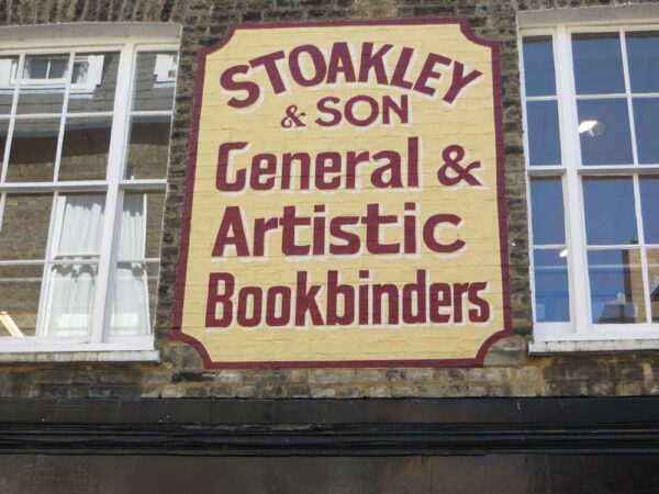
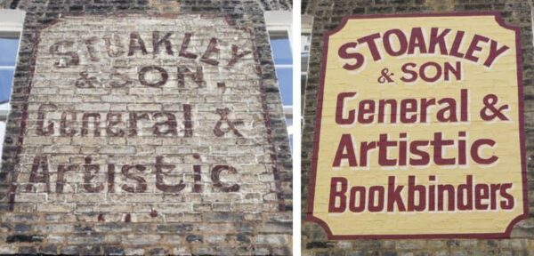
The approach of tackling a whole city’s ghostsigns in one project is reminiscent of the controversial proposals to do something similar in Butte, Montana. It also echoes the co-ordinated efforts of local and national groups in the Netherlands to research and restore painted signs. (See previous pieces about the Netherlands here and here.) In the case of Cambridge, they are taking what appears to be a diligent approach, using a pilot scheme to assess the viability of the project overall, and to determine the best methods. The first sign to be repainted within the scope of this project is the one shown below, before and after, for Stoakley & Son on Green Street.
Ben Attenborough who originally tipped me off about the wider project highlighted the following extract from the Council report:
The signage will have degraded over time including flaking and fading, some of the signage is in such poor condition that the original sign cannot be made out. There may be historic photographs that will give an indication of the original signage. The majority of photographs will likely be in black and white, so indications of the original colours will not be possible. A level of artistic interpretation will be required and the level to which this will extend will need to be agreed prior to the works.
Placing the original faded sign and the now repainted effort side by side shows that the level of ‘artistic interpretation’ in this case has been quite substantial.
Ben makes the following observations with respect to this restoration:
The council has used a certain amount of artistic licence with regard to the sign, shifting up the words ‘General & Artistic’ and inserting the word ‘Bookbinder’ below…I am unsure about the choices of colour.
Given that the Council would have had access to plenty of photography of the original faded form of the sign it is surprising to see much of this source material ignored in the restoration. It is clear that the fading original did have a line of text underneath ‘Artistic’, and ‘Bookbinders’ would fit with the fragments that remained and presumably tallies with local archival records for the business. However, completely changing the layout seems to go against the broad intent of the project.
Substantial adjustments have also been made to the lettering style which was clearly visible on the original. For example, compare the following on the before and after above: Top of the ‘G’ in General; Ampersand between General and Artistic; Tails of each ‘t’ in Artistic. There is also the blatant loss of the comma after ‘Son’.
This could be considered a worrying precedent for the future of the project, especially as this pilot has been congratulated by members of the Council. Described as ‘a great start’ by Councillor Lewis Herbert, I think that some of the issues outlined above need to be examined more closely before embarking on any more restorations in the city. It seems that quite basic pieces of research have been ignored in this first attempt and, should this continue, there will be numerous other poor restorations across the city.
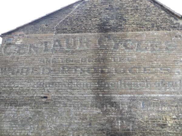
As it stands there are over 20 signs in line for similar treatment, although one of the city’s finest (for Centaur Cycles) appears to have been overlooked in the initial survey. Perhaps this is a blessing in disguise if it is to be spared the treatment of this Stoakley & Son sign.
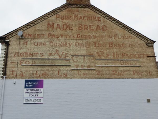
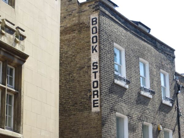
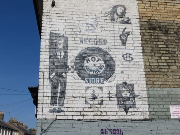
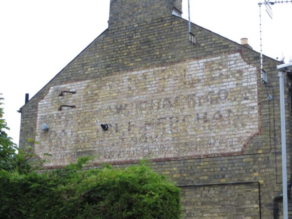
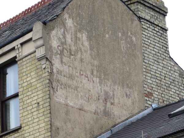
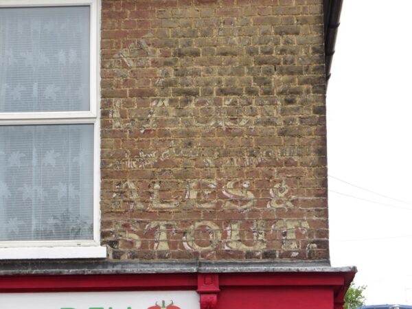
The following are a collection of some of the signs from the report, as photographed by Ben Attenborough. Thank you Ben for bringing this project to my attention and for the images you have shared. I will now be monitoring future developments closely…

