22 Aug 2012
Dana Forrester, ghostsigns and classic cars
Work on my book means that I haven’t been blogging as diligently as usual so this is getting back to it.
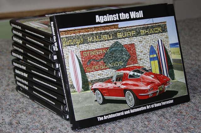
Through William Stage (author of ‘Ghost Signs‘) I became acquainted with American watercolour artist Dana Forrester. Dana is an artist who uses ghostsigns in his original works, alongside a number of other artists who I’ve profiled on this site before.
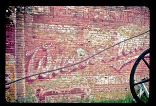
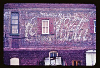
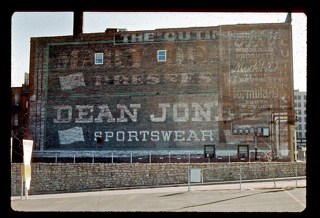
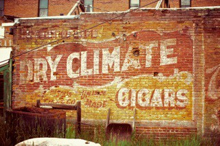
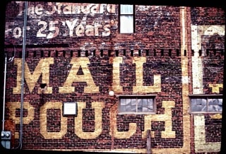
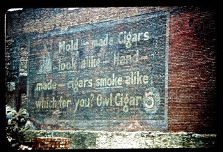
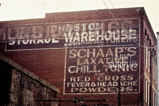
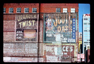
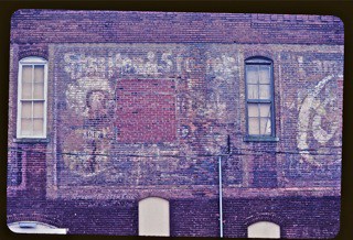
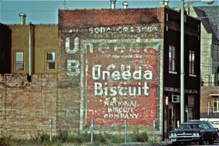
After buying a copy of Dana’s book I took the opportunity to ask him about his work. He kindly offered to share his thoughts which are featured in an extended interview below. He also shared some of his original ghostsigns photography, much of it dating back to the 1970s. The gallery here is just a miniscule sample of over 12,000 images he has collected over the last 40 years or so.
Interview follows these images.
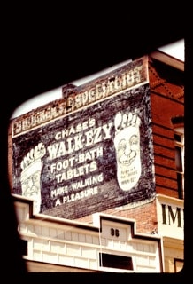
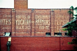
1. Can you tell me a bit about yourself, where you’re based and what you do for a living?
I have lived in the Kansas City, Missouri, area since 1972, and have painted strictly in Watercolor since about 1974. I was an advanced level art teacher from 1972 until my early retirement in 1987, and I’ve worked as an artist since that time. I rely solely on my art for income, but have a wonderful wife who had remained in education.
2. When did your interest in painted advertising on walls start?
I discovered my first brick wall advertising sign in 1974, doing an assignment for a graduate study course in photography. I walked out of an alley and turned to notice a series of five wall signs on a building two blocks from where I grew up and realized I’d never noticed them before. They were extremely interesting because of the overlapping of several signs and the creation of numerous abstract forms other than lettering.
I was currently searching for a unique subject and style of art and I challenged myself to paint these in detail. This first one took about three months working nights and weekends, and I swore I’d never paint another. However, I entered it in the American Watercolor Society exhibit in New York and it was accepted. That experience launched my further interest in finding and studying brick wall signs.
3. At what stage did your interest in painted advertising on walls begin to influence your art?
Very early in my painting career. I had been painting American rural landscape architecture, discovering forms and shaped I’d not been familiar with. The discovery of that first wall sign, the painting of that sign, and the success of that painting changed my outlook and direction. I began searching for these wall signs throughout the Midwest.
4. Your work features the juxtaposition of painted advertising on walls with classic and performance cars. What is the meaning behind this and what came first, the cars of the signs?
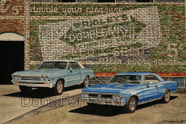
The brick wall art began in 1974 and continue as my main focus until about 1988 when I bought a 1966 Corvette Coupe, a design I’d always admired. I began painting a series of works just of that car and for my viewing only. As I reached a burnout point with the multi level wall signs, I eventually inserted an older Corvette in front of a Chevrolet dealer sign and a new level of public enthusiasm for my work began. I didn’t believe the two items would work, and I was surprised at the popularity. At this time, I create these works showing the contrast of the shiny, highly reflective automotive finishes and the scruffy, roughly textured brick wall signs. Contrast is one of the most interesting elements of design.
5. In what ways would you say your work conveys a sense of ‘Americana’ and is this your intention as you go about creating your pieces?
I do intend my work to have the feel of America, although I’ve done a few Euro cars with an effort to define them with an appropriate background. I try to insert typically American products behind American vehicles, but non-automotive subjects use more overlapping signs to define older historical ads.
6. Do you see any connection between the vehicles you depict and the large numbers of hand painted signs found on highways in America?
The connection is that there were huge amount of wall signs that made the landscape very typical, and the cars I choose are higher volume models as well.
7. Can you describe the process of creating one of your sign/car pieces, both conceptually and practically? Has your style been influence by any other artists?
The primary influences are Andy Warhol, Andrew Wyeth, Edward Hopper, and Piet Mondrian; that’s quite a wide spectrum of influences but valid. I’ve taken thousands of photographs of wall advertising and funky store fronts since 1974, and they can inspire a concept for a painting.
I often create the idea from everyday life, or a memory of a particular product and how it might relate to either a building or automotive subject. I start with a series of preliminary sketches on a thin, easily erasable paper, refine it and if the image succeeds, then is transferred to the final watercolor paper. Often I use a combination of an existing sign on a building and combine it with a fictional sign by overlapping them, then add a window structure, fire escapes, power lines, trash containers, etc. until I create something similar to Piet Mondrian’s abstract compositions. Most viewers don’t notice that compositional structure.
8. Are all the signs featured in your work based on real signs?
Some are based on real signs, but often my imagination gives me ideas and I research my library or the web for authentic advertising.
9. How many works have you produced in this format and are you continuing to create more?
I’ve painted hundreds of watercolor images using the brick wall/advertising sign format, some as small as 7″ x 10.5″ and some as large as 30″ x 72,” but I don’t have a specific number recorded. I can’t imagine not creating more. I am always looking and using the creative process to move forward. I’ll stop painting only when I die.
10. How did the book come about and do you have any plans for future publications?
I had a friend that was good customer, and he is a small publisher in Oklahoma. We wanted to do the book and made it financially possible for it to happen. Since I’ve published the book in 2004, I’ve created more than enough new automotive art to print a new book larger than the first. However, my intent is to create a book that features everything I’ve done since 1974. I have 35mm slides of most significant works and am working at scanning those slides into a digital format (a slow process) so I’m not close to beginning the writing portion of the book. I envision a 300-350 page large format book that documents all that I’ve done and, at this time, plan to have it printed digitally by a web printer and print a small number of books, then sell them on demand.
11. Do you have any other projects that differ from this signature format that you have developed?
I have done a couple of works in my ‘Wine Series’ and four works with a subject of Key West, Florida. In 2003, I created a Limited Series of Corvettes as a fundraiser for the National Corvette Museum. We actually did about 90 Corvettes with a graphics package and several mild performance upgrades to make it a collector’s item. I’d like to find a sponsor to create another special series.
12. Where can people find out more, get a copy of the book and order prints or originals of your works?
Anyone interested in seeing more of my work or ordering can visit my website at www.danaforrester.com. I can be contacted at dana@danaforrester.com to answer any questions. I create about 10-15 new commissioned works annually and another 7-10 originals for the open market each year, so the demand it stays vigorous and most original work sells pretty quickly. Everything is available as a print series and in four sizes on paper and two sizes on Gallery Wrap Canvas. The book can be bought directly from this page on my website.
Thanks Dana for taking the time to talk to me and for sharing your fascinating ghostsigns photos. I look forward to seeing more of your work in the future and your next book when it is published.
