27 Mar 2008
John Henstock
I got in touch with John Henstock recently as he’d started uploading some of his pictures on Flickr.
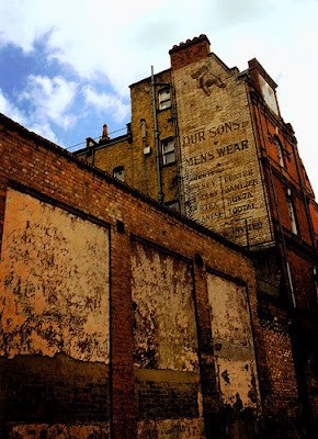
Here’s one example from Brixton for Our Sons Menswear (funny, I’d always read it as Dursons Menswear!). They interested me because of their very distinctive look and so I asked how he had achieved the effect. He kindly wrote back with the following:
“This is the first time that I think I’ve been asked how I do something, I’m usually left wondering that about others’. I’ve been using a filter in photoshop called “dark strokes” which gets a nice painterly effect, which is the distinctive feature, most of the rest is just tweaking levels and saturation etc.”
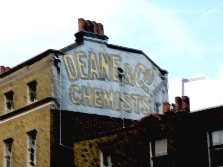
This is another means of interpreting the signs and reminds me of the work done by Martin Thompson. Interestingly there is a lot of overlap in the signs used by both John and Martin. As with the original Ghost Signs video I had to have a go myself and my first effort is shown below, this the prominent Deane & Co sign opposite Clapham Common Station. John’s work is clearly more refined than mine but it’s opened my eyes to what can be done with a bit of time in the photoshop edit suite.


