13 Aug 2014
Ghosting with Ghost Signs: An Experiment in Risography
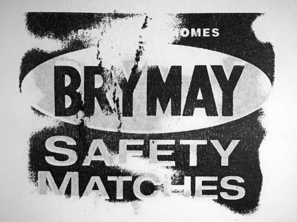
One of the things I most enjoy about my work on ghostsigns is getting involved with student projects using the signs as a springboard into other creative processes. I’ve helped on a number of these, most recently the work of Gloria Soria at London College of Communication. She has now completed her studies and took some time out to explain her approach to the topic, and the final output, in this guest blog post. Thank you Gloria for sharing your work and for the copy of the final book that now sits proudly in my growing collection of ghostsigns goodies. Over to you…
Ghost Signs
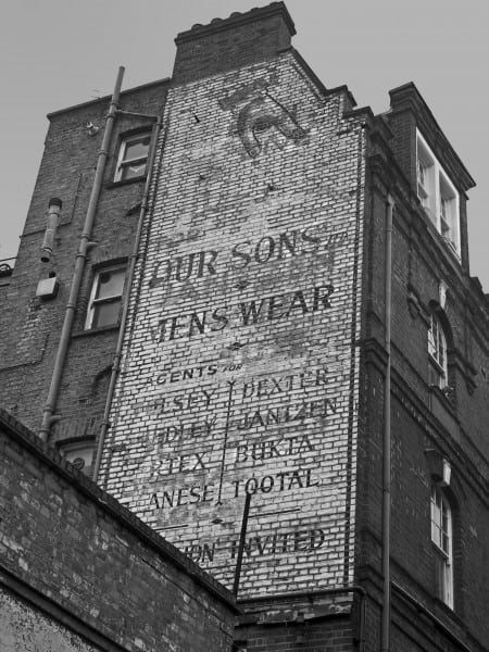
In the early 1900s hand-painted advertisements on the façades of buildings, also known as Brick-ads, flourished in cities around the world. They were the predecessors of our printed posters, signs and billboards.
The heyday for these hand-painted advertisements (1920s-40s) came to an end in the 1950s-60s, when billboard technology started to develop very quickly. This led to printed advertising becoming more accessible and increasingly utilised over hand-painted forms. Printing advertisements had the benefit of being quicker, cheaper and reproducible at a consistent quality in large numbers.
Brick-ads were then left behind on buildings and, over the years, they faded, were painted over, covered up by billboards, cleaned off the walls or had their host buildings torn down. Yet some signs managed to survive. These faded, weathered and almost creepy looking hand-painted signs are what we call now Ghost Signs.
Ghosting Concept
Ghosting is a printing term that refers to a faint printed image that appears on a printed sheet where it was not intended (Printing for Less). It is usually viewed as an undesirable effect which can appear in several different print processes, although it is most commonly seen in lithography. Ghosting can be caused by inks, paper and rollers (PrintWiki).
Ghost Signs & Ghosting
In order to recreate Ghost Signs, I merged these two concepts: Ghosting and Ghost Signs. Through intentional Ghosting, I managed to create realistic Ghost Sign images using a process developed with a Risograph printer. (More about the Risograph: Studio Hato.)
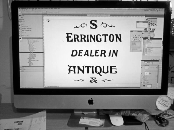
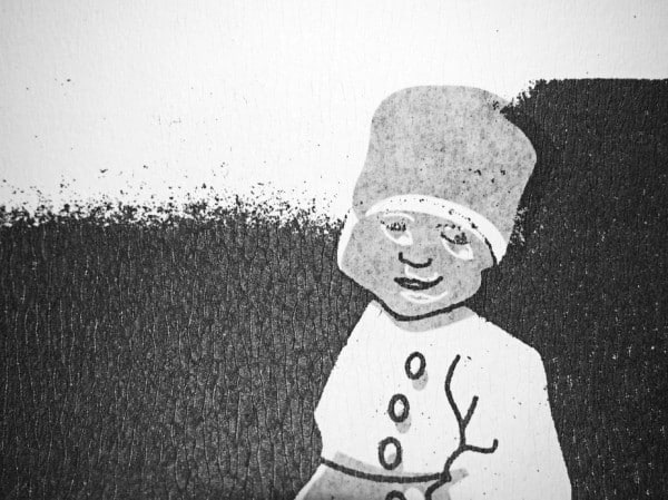
Each Ghost Sign is created by combining two images together, one on the front side of the page, the other on the back. Through ghosting, due to the transparency of the paper, it is possible to obtain different tones of black that add depth and realism to the image.
To obtain a faded effect through mechanical means, the master images used on the Risograph were scanned from prints made on previously oiled paper. This made the images transfer unevenly. The more oil on the paper, the more translucent it is.

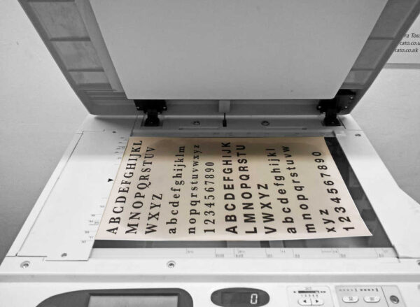
To add more realism to the images, they were printed on a very textured paper stock. Adding colour to the images did not feel necessary, especially considering the restricted number of colours on the Risograph. The decision to use black and white imagery allowed greater focus on the form of the images.
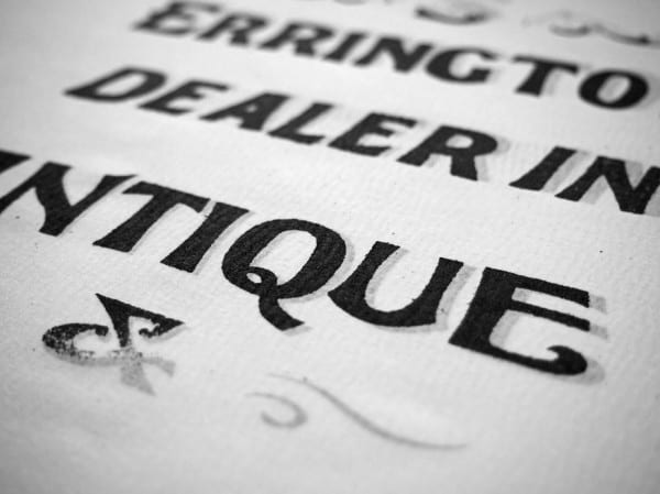
To compile the work, I bound my created Ghost Signs into an A3 booklet, along with some photographs of the original source Ghost Signs.
Reflections
This project was a set project at London College of Communication which started out with the following broad guidelines:
“Given a printing terminology and a tool, find out what your term means and try to articulate it through a piece of print generated with your chosen tool.”
In my case the printing term was ‘Ghosting’ and the tool was the Risograph. It was important for me to engage in the process of experimenting until I found what turned out to be my final process and output. Pushing the boundaries of imagination, and following an uncertain experimental path, was fun and definitely rewarding.
Thanks again Gloria for sharing this work, a fascinating interpretation of the ghostsigns around us.


