1 Sep 2012
Ghostsigns and Smiths Grand Teas in the Countryman

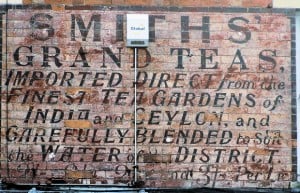
This photo by John Vince features in a short piece he’s written on ghostsigns for the Countryman. The sign, from Leicestershire, also features in the History of Advertising Trust Ghostsigns Archive and has the wonderful ‘act local’ line of “Carefully blended to suit the water of the district”. It also has a remarkably diverse set of letter forms on one sign with serif, sans serif, upper case and lower case all vying for position, often in the same sentence. John says of the sign:
This sign, in Oakham, Rutland, is a reminder of the days when grocers blended their own brews to suit their customers’ tastes. We still can learn a lot from the typography used in the early part of the last century when names like Ceylon were commonplace. It must have taken many hours of work for a large sign like this one to have been created. It is placed above the shop window and perhaps the signwriters had to keep moving their ladders in times when health and safety considerations did not exist.
It is a lovely exemplar of the form and just needs to burglar alarm to be moved to be restored to an approximation of its former glory. The HAT archive have dated it to the 1920s so it is not far off antique status. A mapped copy can also be found in the My Leicestershire History archive.


