10 Aug 2012
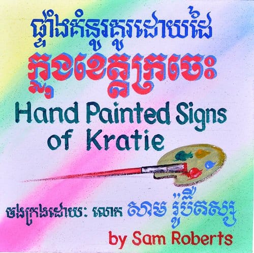
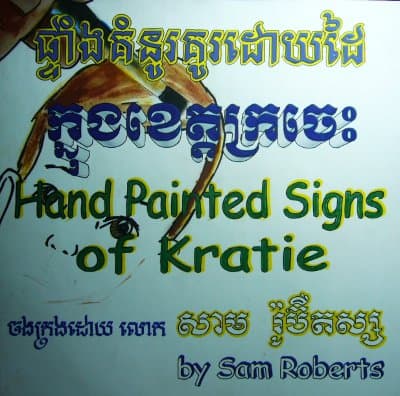
Cover for ‘Hand Painted Signs of Kratie’
Here is a preview of the hand painted cover for the ‘Hand Painted Signs of Kratie’ book. You can also see some photos and video of the work in progress on this. Sadly when I went back to see some more painting in action I was, instead, presented with the finished piece.
For a glimpse of what will be inside the book check out these preview page layouts and for some other content have a look at some of the more interesting translations of the hand painted signs of Kratie.
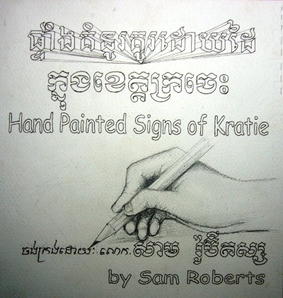
Below are some photos of different stages of the design process for the cover above that helped to clarify the brief and lead to the finished piece. Much of these discussions were held in sign language (no pun intended!) and so it is quite an achievement to reach a final piece that I’m very happy with in just three iterations.
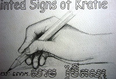
The original pencil sketch presented by the signpainter, Chouk Rachana. When I tried to explain that I wanted the illustration to represent painting there was lots of confusion. He repeatedly said that the finished one would be painted (referring to the signboard itself) whereas I was commenting on the need to change the pencil to a paintbrush. It’s a slight shame that the idea of the hand painting the actual letters of the sign got lost along the way.
Close up of that particularly confusing illustration.
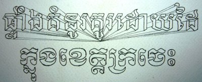
I really liked the perspective effect on the top row of text but this was also lost along the way. I suspect that replicating that in paint, especially on the eventual polystyrene surface, may have been asking too much.
When I went back again I was presented with this layout. I was confused as to whether this was being given to me as the final piece or not. However, I wasn’t happy with a few elements, primarily the use of felt pens for the colouring, the illustration not being a good fit and also the way it interferes with the text.
Once again it was over to the power of body language and my basic Khmer skills to convey my feelings and progress to the next step. I have to confess that at this stage my optimism was low and I was starting to think about contingency plans.
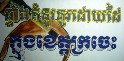
This time around I really l liked the lettering on the second line of text.
In the end I’m really pleased with the outcome and looking forward to seeing how it will look on a test print of the book which I’m having done soon. More news to follow…

