1 Jul 2012
Faux ghostsigns

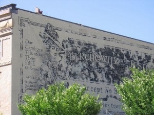
Sometimes hand painted signs on buildings are created to look old and weathered intentionally. The example pictured (original photo on Flickr) was produced in 2003 for the Disney film, ‘Miracle’. (Does anyone have a clip showing where and how it features in the film?) Another Disney example is this sign for the ‘New Orleans Trading Company’ found in Disneyland California.
In other cases the effect of ageing the signs serves a specific function in the nature of new commercial communications. This happened with the Dewar’s whisky campaign by Colossal Media which used a variety of techniques to give the final signs that old time look. This was done to reflect the old time values of the brand, in a very similar way to Jack Daniel’s, another whisky whisky brand. Rick Janzen at Streamlin Studios has also explored the use of watercolours to create the effect of a ghostsign.
Another form of ‘faux’ ghostsigns are spoofs. The main example that I’ve come across is the work of Jerry Johnson, a former signwriter who has produced some spectacularly huge and lavishly produced murals that serve no other function than providing amusement and social commentary.
Finally, there are examples of signs being produced within artistic interpretations of the subject matter. Keith Hampton at It’s All Art is one example of this on a large scale, while Emmanuel Nouaillier does something similar at the micro level.
These are a handful of ‘faux’ ghostsigns that I’ve come across over the last six years or so. Do you know of any others along these lines, produced for other purposes, or using different techniques?


