5 Aug 2010
Anchor
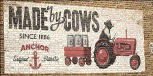
Photo: Creative Review
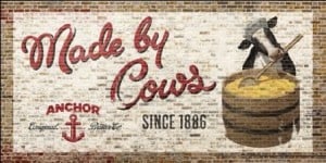
Creative Review and a few others have spotted this new outdoor campaign for Anchor Butter. When I first saw the photos I assumed they were genuine hand painted ads but they are actually printed billboards which, in the case of the press shots, are cleverly cropped to suggest otherwise. Caroline‘s photo below shows one in situ.
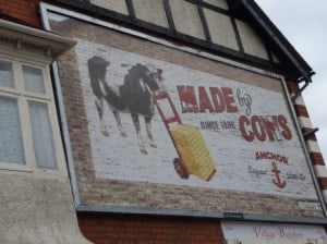
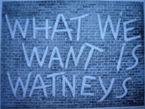
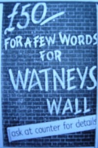
The work is by ad agency CHI* and Gavin Lucas at Creative Review has suggested that these may have been inspired by the recent launch of the HAT archive. I would take things even further back than this, to 1938 in fact, when Watney’s ran a campaign by ad agency Horrocks & Company. These early posts (here and here) give some more details about the campaign and the related competition. (Sorry for the image quality, I hadn’t figured out my camera settings back then!)
I like the Anchor posters and they are much more visually striking than a lot of the drivel that gets plastered up around the place (but then I may be biased?). I only wish they’d taken things a step further and actually gone all the way to produce some hand painted signs (like Stella Artois) – there would have been a real authenticity to this, butter made by cows, hand painted signs painted by hand etc etc.
As an aside, I was thinking about animals in Ghostsigns and off the top of my head could only recall this lovely Bovril one in Leicester.
I wonder who will be next to use the hand painted form as a springboard into something new…
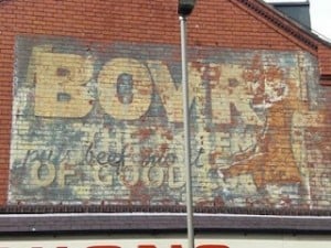
Photo: Amy Jane Barnes
*The creative team at CHI responsible for the Anchor work are Matt Collier and Wayne Robinson.

