30 May 2008
Bile Beans Part 2

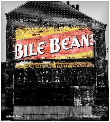
Although I’ve been aware of this Bile Beans sign for some time I was struck by Andy Johnson‘s picture seen here as it really highlights the brightness of the sign versus the surrounding area.
It has been tinkered with slightly but provides an insight into how much the original signs must have stood out against an otherwise bland environment. Facing little competition from other bright colours and lights, these painted signs would have been impossible to ignore. Andy correctly points out that the good condition of the sign has been maintained by protection from the elements due to being covered by a billboard for many years before being revealed in c.2005/6.
Andy says of the slight image manipulation:
“It was a bit of a gray day so I just took the facade not the surrounding area. ‘Post prosessing’ used a levels adjustment to darken and put more colour in, desatured the outside and buttonised the edges.”
This could be considered another means of dramatising and interpreting the signs, along the lines of Martin Thompson and John Henstock.
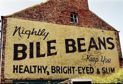
There is another sign in York which I have previously written about but each one has a different slogan. Here we are told it provides users with the “the ideal tonic laxative”, whereas the other one informs us that Bile Beans will “keep you healthy, bright-eyed and slim”. Presumably they originate from different eras and, although the diagonal writing of the brand name remains consistent on both, the typeface has evolved from one to the other.

Thank you to both Andy and Peter for the use of these pictures.


