25 Mar 2012
Graphic DNA documents the visual language of the street
I’ve recently been in regular contact with Geraldine Marshall whose project, Graphic DNA, caught my attention. It is the topic of her PhD thesis, under the supervision of Dr Caroline Archer. I took the opportunity, before she gets too busy, to ask Geraldine some questions at her base in the Midlands, from mine in South East Asia. Here are the results…
1. Can you give me the ‘elevator pitch’ for your project. What’s Graphic DNA all about?
“The project is all about documenting the visual language of the street/city, and in doing so develop a taxonomy from which social, geographical and historical data can be drawn.”
2. You’re basing your work in Birmingham. What is the personal significance of the city for you and why is it an interesting place for a study such as yours?
“I was born in Leamington, and grew up in Coventry. I was familiar with Birmingham having grown up loving the independent music scene of the 80s/90s. My miss-spent youth consisted of visiting the historical rag market for the alternative second hand stalls, bunking off school to see bands such as The Damned at the Odeon (now a cinema) and dancing, drinking a terrible cheap beer called Hummingbird (now closed). Birmingham always seemed like the metropolis of excitement and ever-evolving change, even then, but I didn’t actually move to Birmingham until about 2003 to be with my then husband-to-be.
I’d always had an interest in design, particularly the historical aspect of commercial graphic design, so typography was an important aspect of that. Through my interest in photography I found myself taking a lot of pictures of type and lettering. I was aware of Birmingham’s strong connection to typography – obviously the Baskerville typeface – and I was made aware of Birmingham’s significant print history thanks to the work of Dr Caroline Archer. Caroline is based at the Typographic Hub in Birmingham City library and her tremendous knowledge in this field introduced my to the Kynoch press and Leonard Jay.”
3. What has motivated you to pursue such a detailed piece of study into a very particular aspect of the city’s lettering forms?
“I had retuned to University as a mature student in 2005 and my passion for type just extended into my work. I developed a typeface ‘Bastardised’ (example pictured below), which was an amalgamation of other typefaces. What I was trying to investigate was whether a typeface could be developed and submerged back into the urban environment.
A Christmas present from my husband, ‘Signs: lettering in the environment‘ by Phil Baines and Catherine Dixon, helped me to put my work into some sort of context. It was this that would lead me to discover other pioneers in the study of urban/public lettering, such as Nicolete Gray, James Mosley, Jock Kinneir, and Alan Bartram to name a few. The work produced has been highly valid though more archival in its approach, and I felt it could be developed into a valuable and exciting project if a system for the collection of data and pictorial evidence could be developed.”
“Overlaying commercially used typefaces together then removing the parts of the type that didn’t marry together developed the typeface.
The idea was to develop a style of lettering from a manufactured typeface.”
“As the typeface is experimental the image is Photoshopped onto the wall. But as you can see here the bastardised type is successfully blending into the environment to give the illusion of a vernacular or ‘off-shot’ applied lettering.”
4. Your project has started with photographically documenting found lettering in Birmingham’s public places. Do you have any criteria to determine which lettering you photograph and which you don’t?
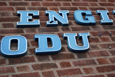
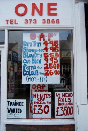
“At the moment the project is focusing on specific areas of the city, main high streets in particular – both current and historical. The main interest lies in the influence and impact of vernacular letterforms. It does not include graffiti, however I have recently documented lettering where graffiti has been used to communicate the needs of local businesses in ways that would have once been the domain of the traditional sign writer.
In these early days of such a large and ongoing long-term project I am pretty much recording anything and everything. Some of the locations are in states of rapid redevelopment so examples are being lost on an almost daily basis. As the structure of the actual taxonomy develops, the selection criteria will resolve what is included and what is omitted. The nature of this taxonomy should be fairly rigid and means that I can’t just include ‘quirky nice type’. There are plenty of books of old signs that designers just ‘like’. I’m hoping the research will lead to greater understanding of why these letterforms exist and how they influence the visual environment around us.”
5. What are the features and characteristics you are using to develop this taxonomy, or that you have in mind to do so in the future?
“The development of the taxonomy criteria is very much at the embryonic stage but obviously will include categories for type style, material, location, historical context, format etc. I am planning to develop a prototype based around a fairly small test area to see what works and what doesn’t in reality. It’s important to get this right at the beginning before rolling it out. So, at the moment, its watch this space!”
6. Can you say a bit more about the ‘DNA’ and what you hope to find as a result of your research?
“There are two elements of the research. The taxonomy is the model to collect the data. The second element of the research is what we can draw from the data and whether looking at the lettering alone from an area can inform opinion on the cultural, social and historical make up of that area.
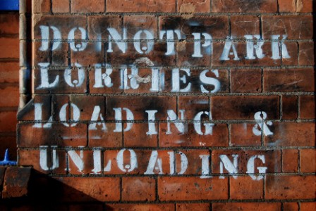
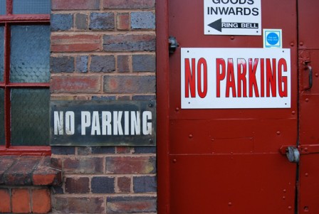
For example, if I were to take photographs in an industrial area such as Digbeth, looking at the signage, there is an abundance of commercial and hand-written notices, stating ‘No Parking’. This could very well give us good indications about the land ownership, or small business population etc just by looking at the signs and lettering.
I believe the visual language of specific areas provides us with the DNA to understand them in a new way that has never really been fully investigated. What I find in Digbeth will contrast on many levels with what I may find in Kings Heath, Birmingham, for example.”
7. Will you be including ghost signs as ‘specimens’ in your research, and have you got anything that you’ve noticed about those that you’ve found in Birmingham.
“Yes – Ghostsigns will be included. What I have noticed is that because the city has undergone such rapid regeneration, particularly within the city centre, a lot of the ghostsigns have disappeared amongst the rubble. This is why your project is not only important in documenting this but will be vital for cross-referencing purposes. Also as a ‘forward’ (Birmingham’s municipal motto), inherently industrial city, I have noted the use of more architectural and trade material for signage, rather than painted signs – again this is something I would need to cross reference with other cities.”
8. Has anything similar to your project been undertaken in other locations?
“Yes, as noted academic researchers such as Professor Phil Baines, Catherine Dixon, have revisited steps of Nicolete Gray, studies in Lisbon, and have continued to document lettering within the UK as with the likes of Alan Bartram.”
9. Can you recommend some books or articles for people who might be interested in related research and literature?
“First and Foremost would be,
- Baines, P. & Dixon, C. (2002) Signs: lettering in the environment.
- Baines, P. & Dixon, C. Letter Rich Lisbon: Nicolete Gray’s 1960s snaps inspire a re-examination of the capital’s streetscape.
- Bartram, A. (1978) Fascia Lettering in the British Isles.
- Bartram, A. (1978) Street Name Lettering in the British Isles.
- Brownjohn, R. (2005) Sex and Typography [Street Level, pg 164].
- Gray, N (1960) Lettering on Buildings.
- Kinneir, J. (1980) Words And Buildings: Art And Practice Of Public Lettering.
Also we are very lucky in the UK to have access to comprehensive histories of lettering, typography, and print, so I recommend making the most of these. I am using the St. Bride Library, London, in particular.
More locally for me, Dr Carolines Archer’s private and vast collections, of typography, lettering and print at The Typographic Hub Library, Birmingham is also an invaluable resource and is open to the public by appointment.
The Central Lettering Record at St. Martins, London is curated by Professor Phil Baines and Catherine Dixon and the collection includes not only their own research but that of Nicolete Gray and Alan Bartram to name a just a few. Once again, viewing is by appointment.”
10. How can people follow progress on the project and/or participate?
“I can be contacted on the following:
- Twitter: @BHamGraphicDNA
- Flickr: http://www.flickr.com/photos/urbanlettering/
- Blog: http://urbanlettering.wordpress.com
- Email: geraldine.marshall@hotmail.co.uk
11. Finally, can you choose five pictures to share with us, including at least one ghostsign, and say a little about them.
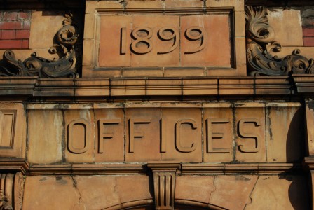
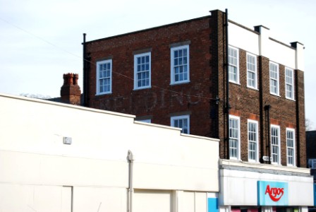
“I’ve included a few throughout this interview to show some of the diversity of type and lettering that I’m capturing within the project. This ‘Bedding’ ghostsign is evidence of a visual timeline of the type of retailer that occupied the building prior to Argos. The choice of typeface and the positioning of the sign in relation to its locality is also significant. It is placed on what is now the back of the property on a suburban street, which provides visual evidence of the changes in the original main highstreet thoroughfare.”
Thank you Geraldine for taking the time to answer these questions and for the reading items which I will need to get hold of soon. I’ll continue to follow your progress and wish you all the best for the next few years of the Graphic DNA project.

